Today's entry follows up on Tuesday evening's "in studio" photo shoot where I experimented for the first time with controlled lighting for portraiture. I have spent quite a few hours pouring over the images in search of things to improve upon. The beauty of the internet is that I have access to thousands of professional photographers' online portfolios and websites. Quick comparisons of other's work versus mine quickly highlight areas of improvement. This weblog has been a great journal to document my personal progress.
For this entry I decided to try my hand at creating stock images using techniques I have spent many hours reading up on. I had always wondered how photographers managed
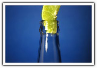
 to get such crisp shots with loads of color and minimal distraction. Searches brought me to websites documenting macro photography and light boxes for product photography. Although I didn't contstruct a lightbox for this setting, I did steal a great tip - $.39 colored poster board and cheap fluorescent lamps. All I needed was a subject. I didn't quite know what exactly I wanted to shoot at first, but the idea came naturally after sitting in front of the computer after work the other day sipping everyone's favorite "Mexican Crown" beer. Once inspiration sets in I don't waste time. After work today I was determined to purchase the necessary props for the shoot. The beauty of the finished product is that you would never know it that in my cramped apartment I manged to set up on the kitchen floor. I took all of these shots while lying on my stomach. All I could think of in my mind was "I need space."
Setup and shooting took all of about 25 minutes. I took about 34 photos before I had decided I had gotten the shots I needed. If you are wondering where the full length bottle shots went, I must admit that metering the bottle and lime together was not working out. The bottle would expose wonderfully while the lime looked like a piece of white ice up top. If I spot metered the lime, then I got some other funky exposure issues on the bottle. Only one shot managed to look right but I just didn't find it suitable to share. Post production included the usual - histogram adjustments, hue correction on the lime, and a bit of color saturation to really bring out the blue poster board.
Cheers...

![[banner_spring09.jpg]](http://1.bp.blogspot.com/_IxW9pxRZGgw/SetdhfkCodI/AAAAAAAABBI/yZutqr7brFg/s1600/banner_spring09.jpg)
No comments:
Post a Comment